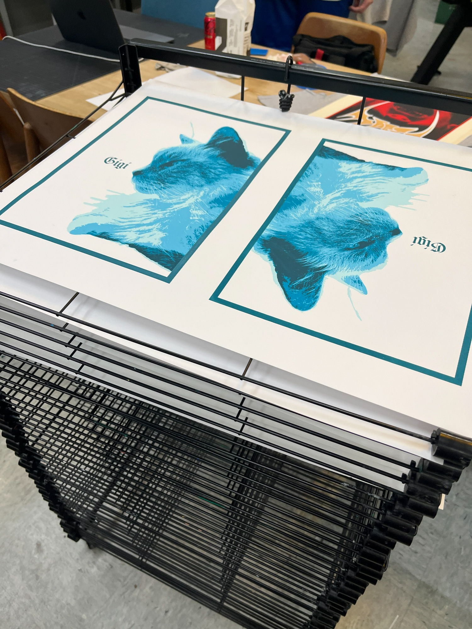
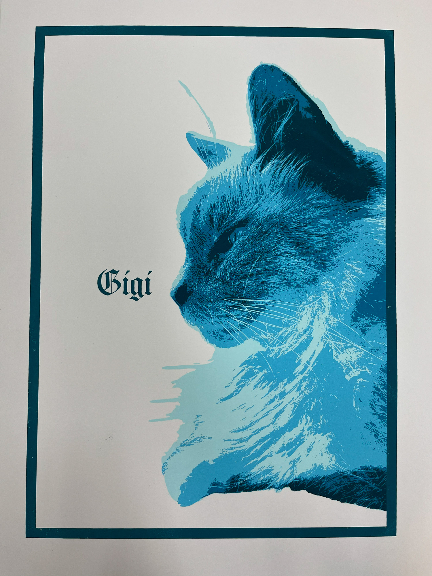
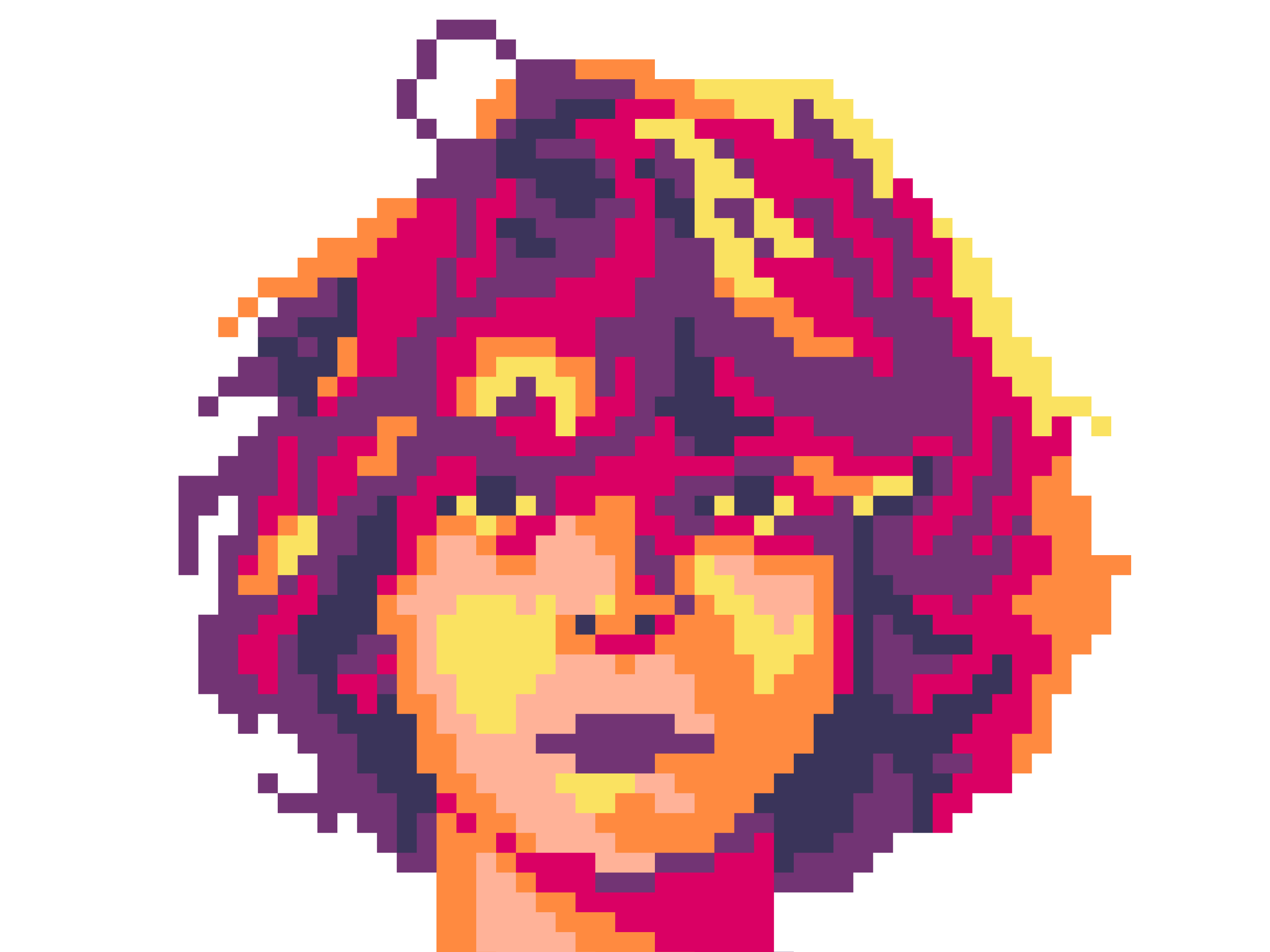
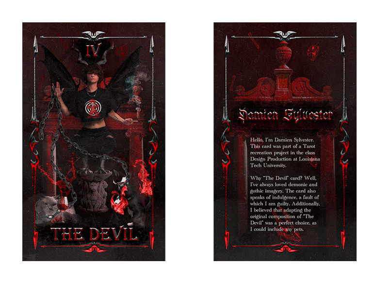
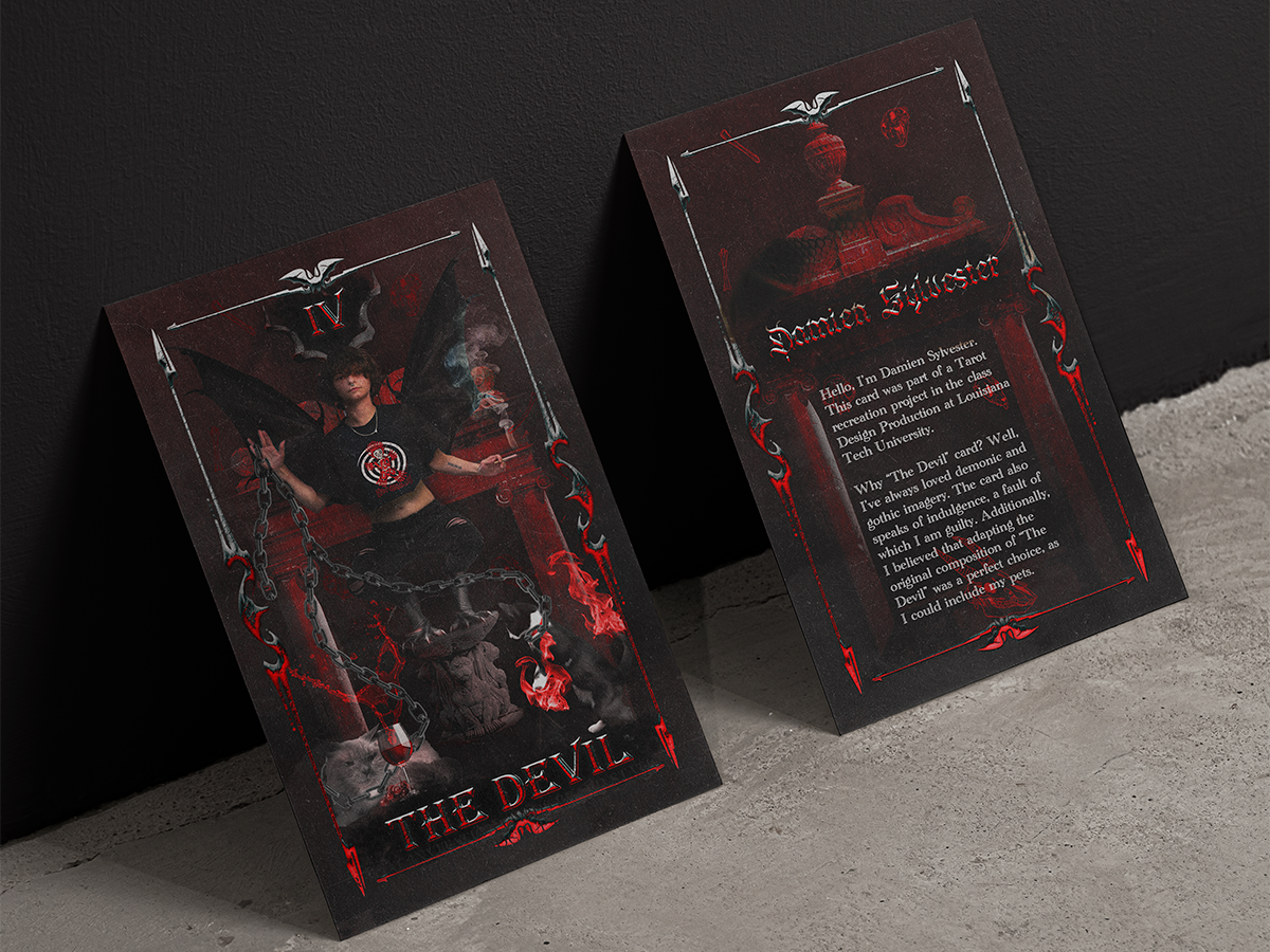
These prints were for a class project in which we had to print 2-3 color portraits; I ended up doing 5 colors and purchasing my own ink to mix with, and ended up quite happy with the result.
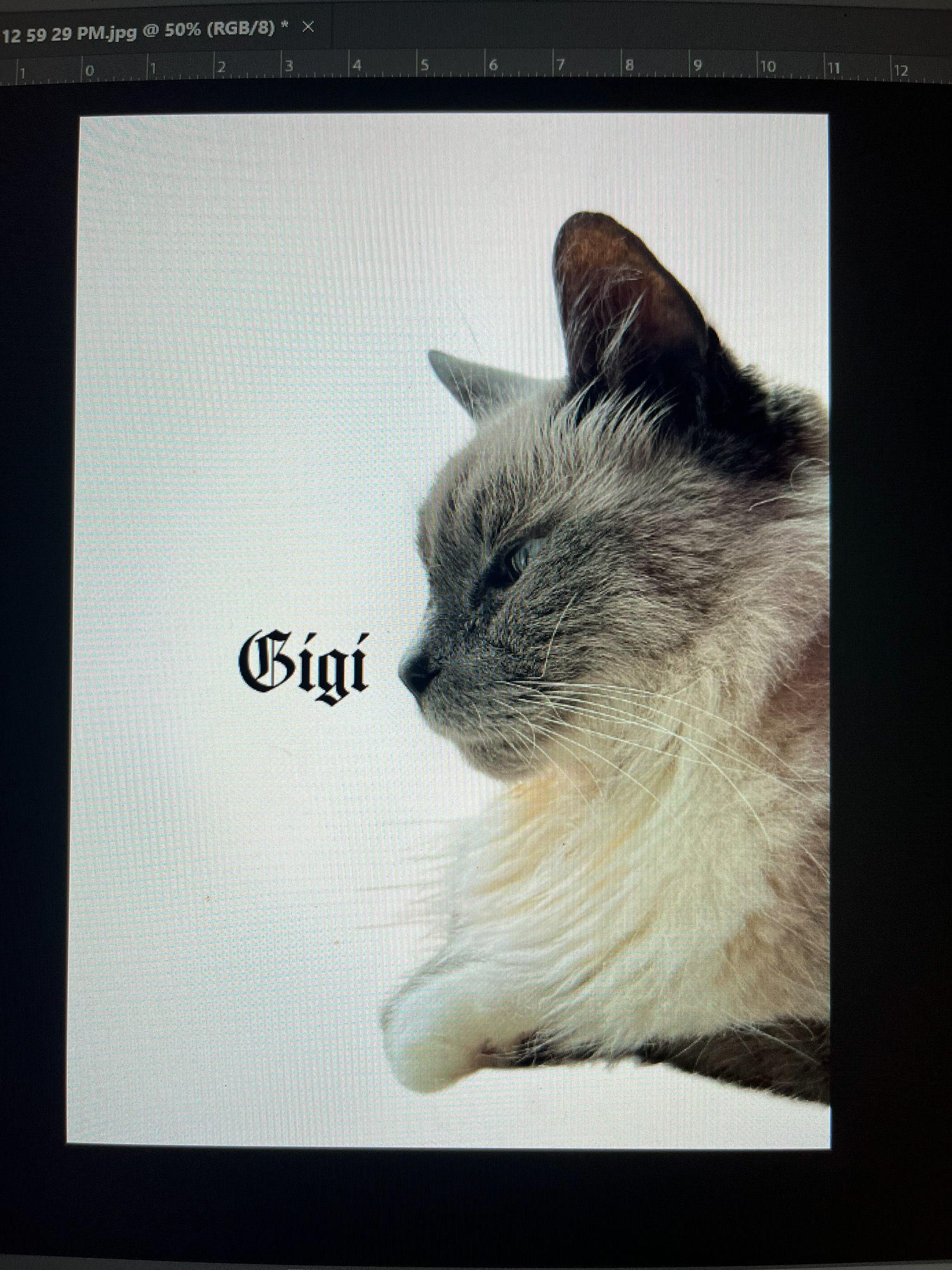
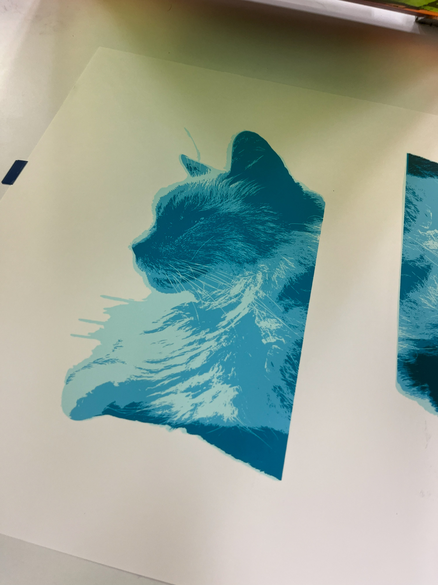
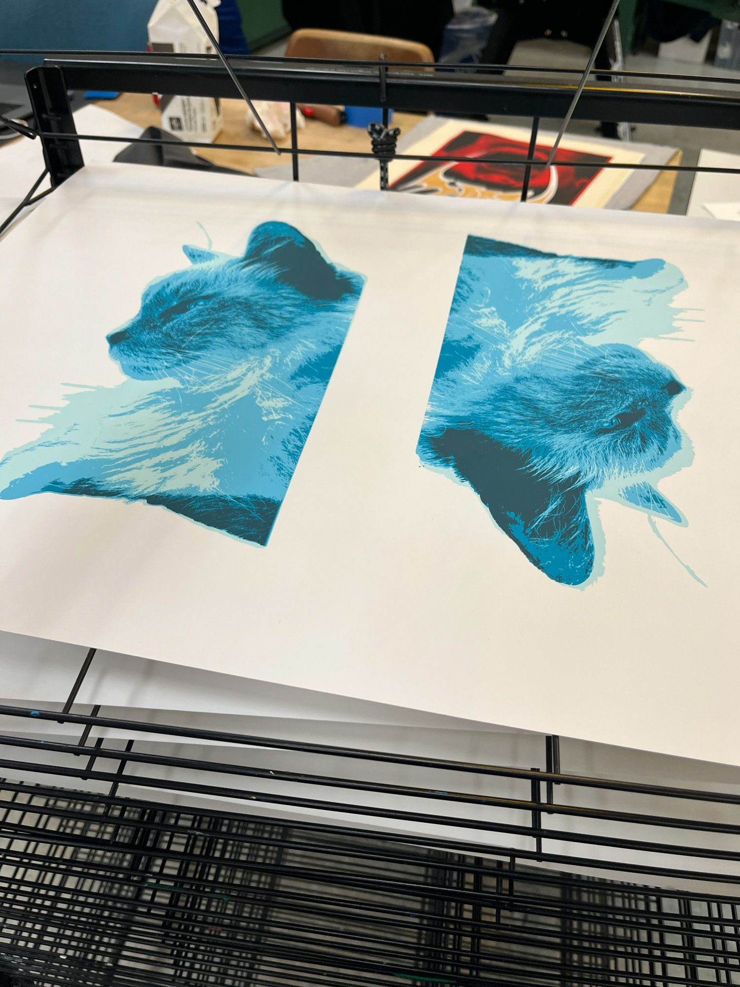
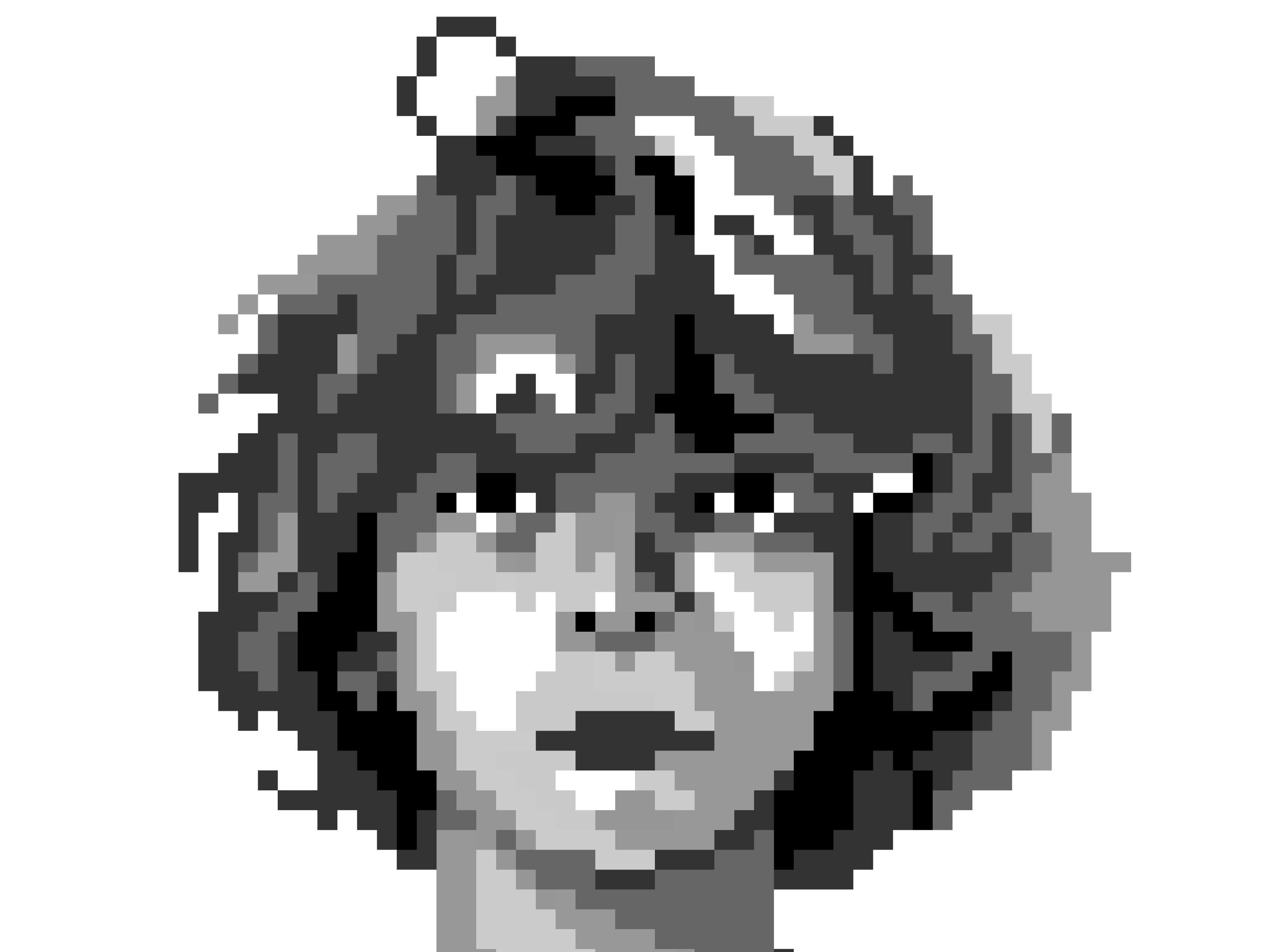
Process: In order to create these prints, we first had to choose a photograph to base the prints off of. After choosing a photograph that would pair well with the range of dimensions we were given, we then brought the images into Photoshop for manipulation. A posterization effect was used, in which multiple copies stemming from the original photograph were saved; each copy was to coordinate with a different color. Ultimately, there were 4 layers to the portrait; silhouette, dark values, midtones, and light values.
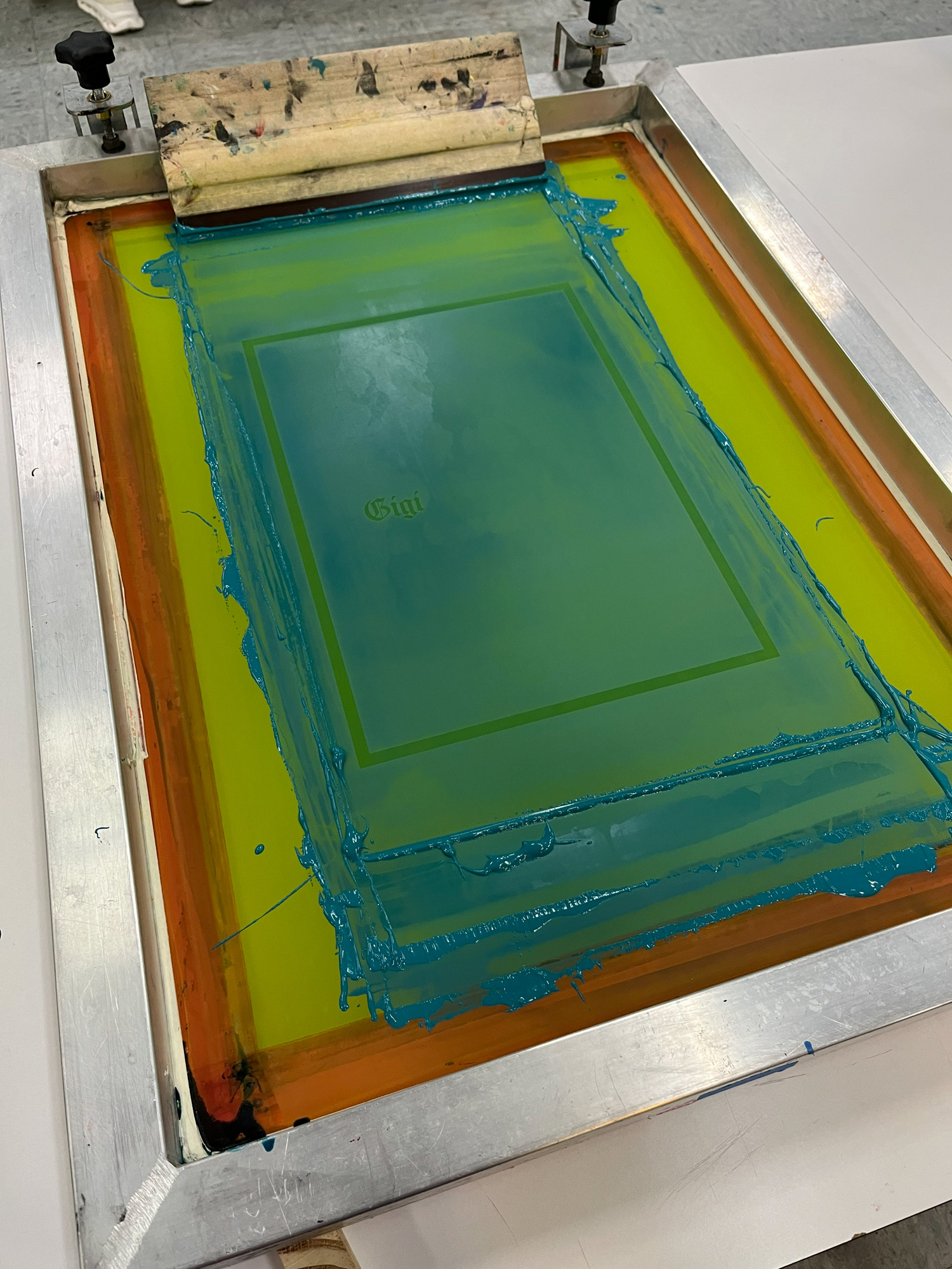
Each of these layers were then transferred to film, which was used to burn the designs into silkscreens. Once the designs were ready, CMYK process color inks were mixed to match the digital mockup as closely as possible. Each ink was applied with time to dry in between, and a minimum of 15 prints were made.
Reflection: Looking back on this project, I think I treated it very meticulously, and the results of such paid off. However, if there is one thing I could change about this project, it would have been to create more prints. While it is possible to mix a strong match to the colors I used previously, using the scraps of leftover ink I retained, it would be quite a lot of work to entirely repeat the process. This portrait is special to me, and I only wish I had made more. However, I suppose the low quantity makes it all the more special and unique.