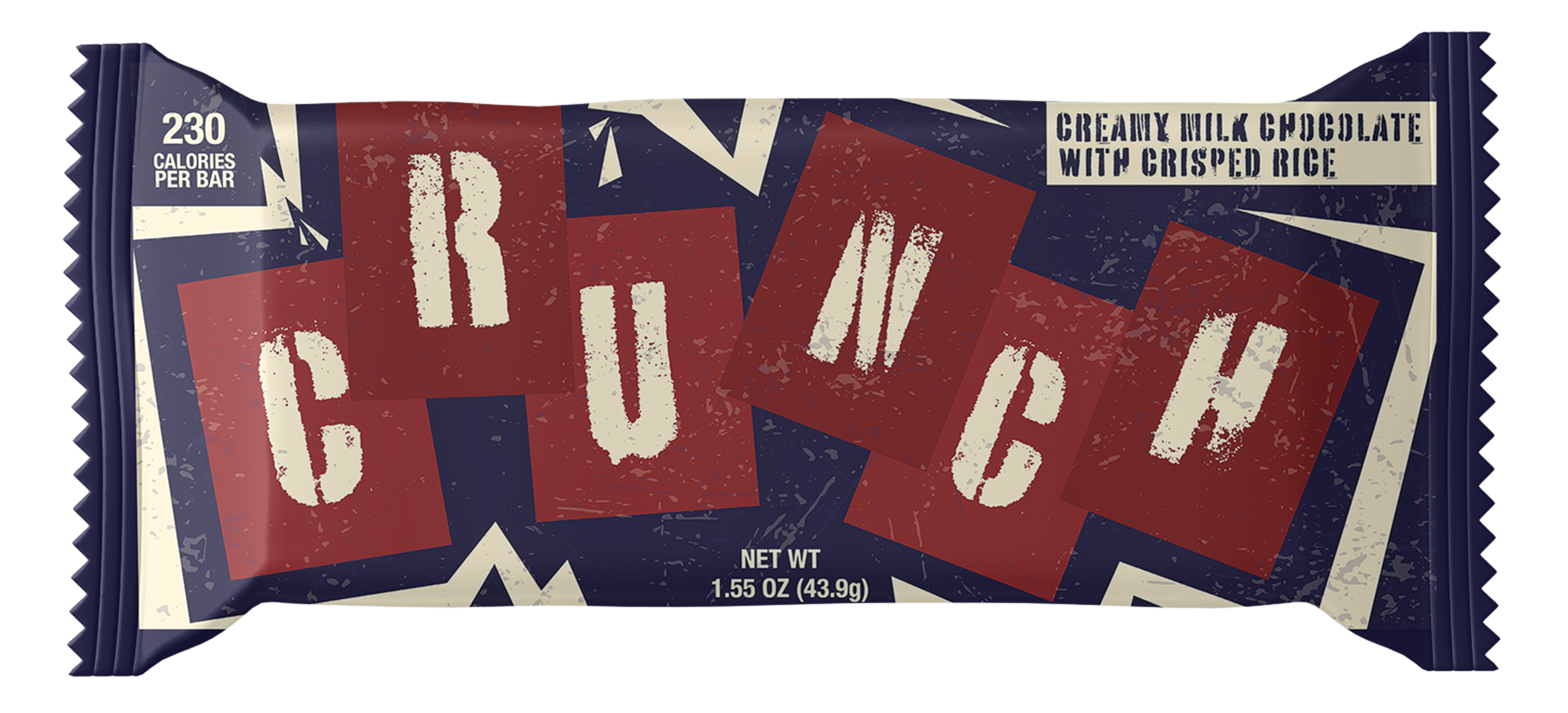
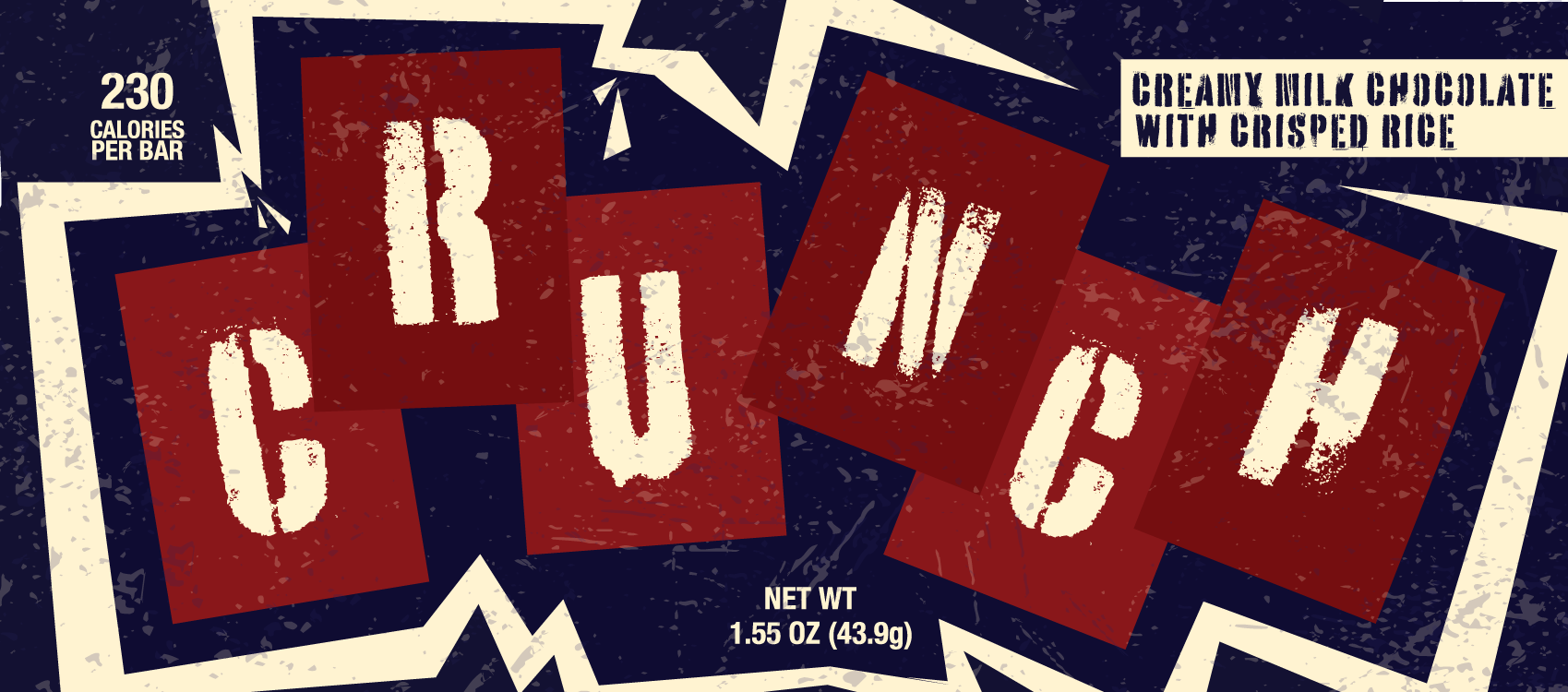
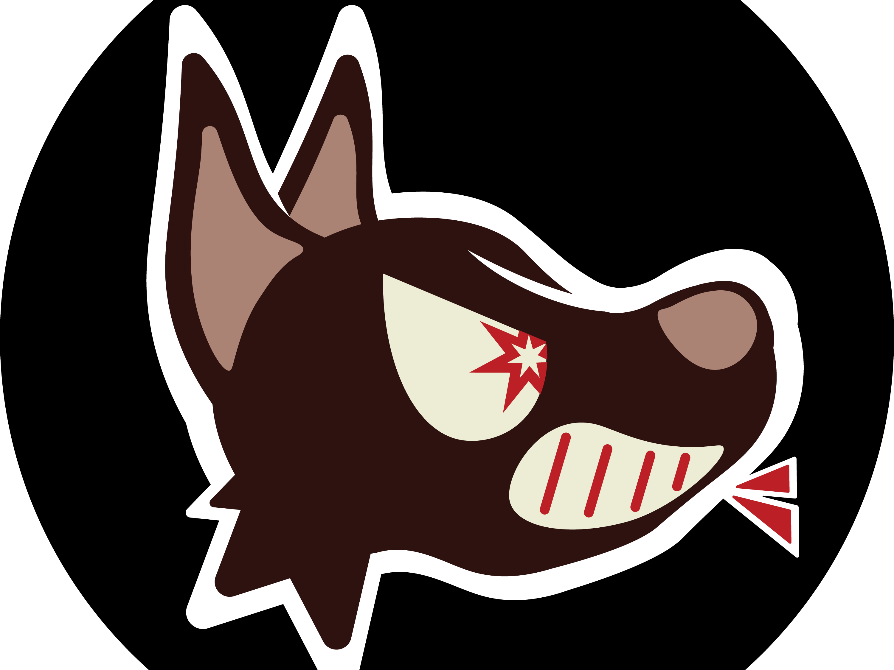
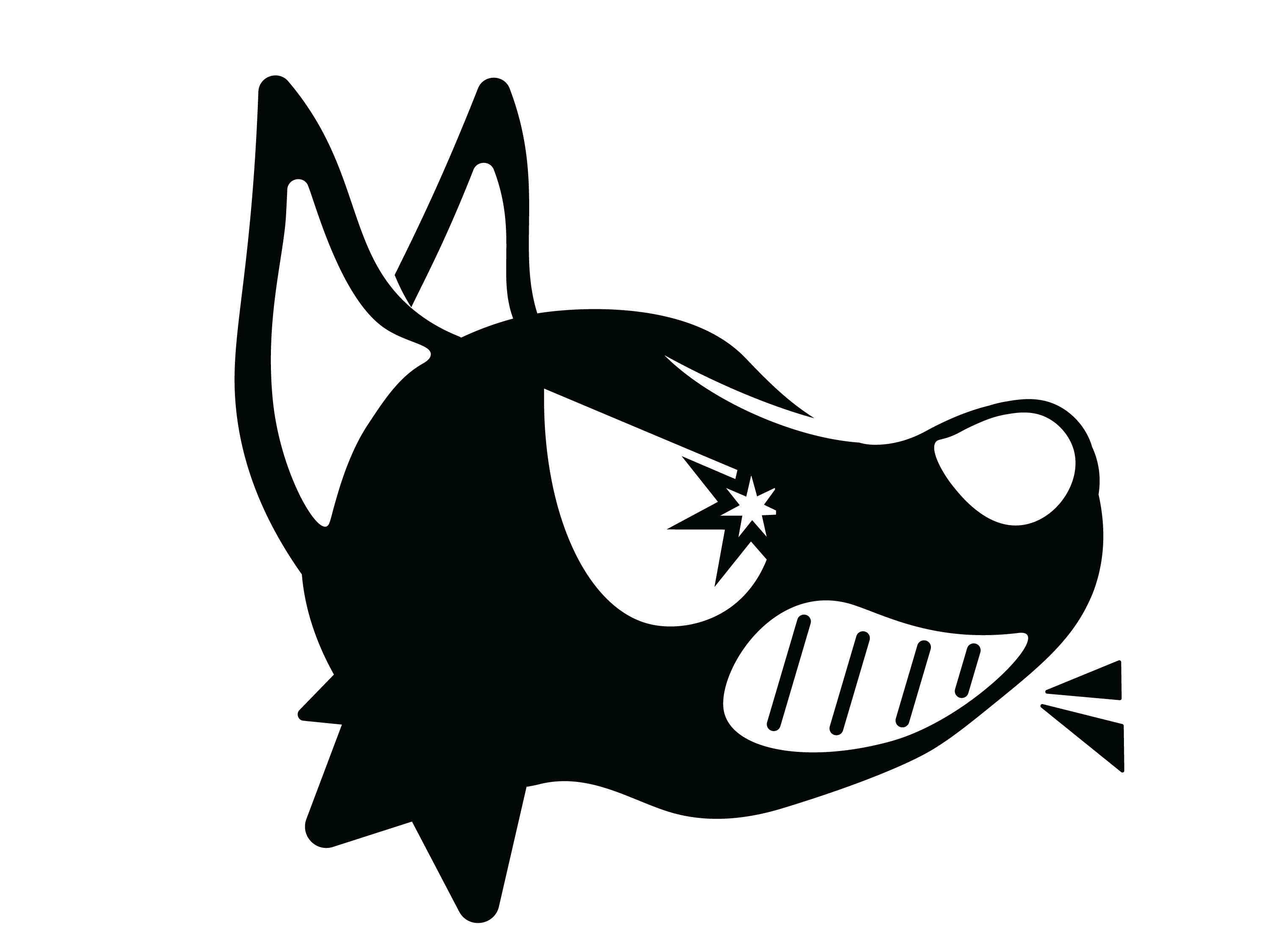
The goal of this project was to choose a personal favorite candy bar, then to redesign the packaging for such. Paired with the choice of candy, students were assigned a style within a particular era of history, in which the style had to become the theme of the redesign. Its main goals were to develop digestible layout and typography, while accurately adapting a design to a particular style. I chose my favorite flat candy bar, the Crunch Bar, and was assigned the style of 1990s grunge.
Process: First, students were asked to go out and purchase whatever candy bar they settled on. With the physical artifact in hand, students were to study the original packaging, as well as researching the brand and previous iterations of its packaging.
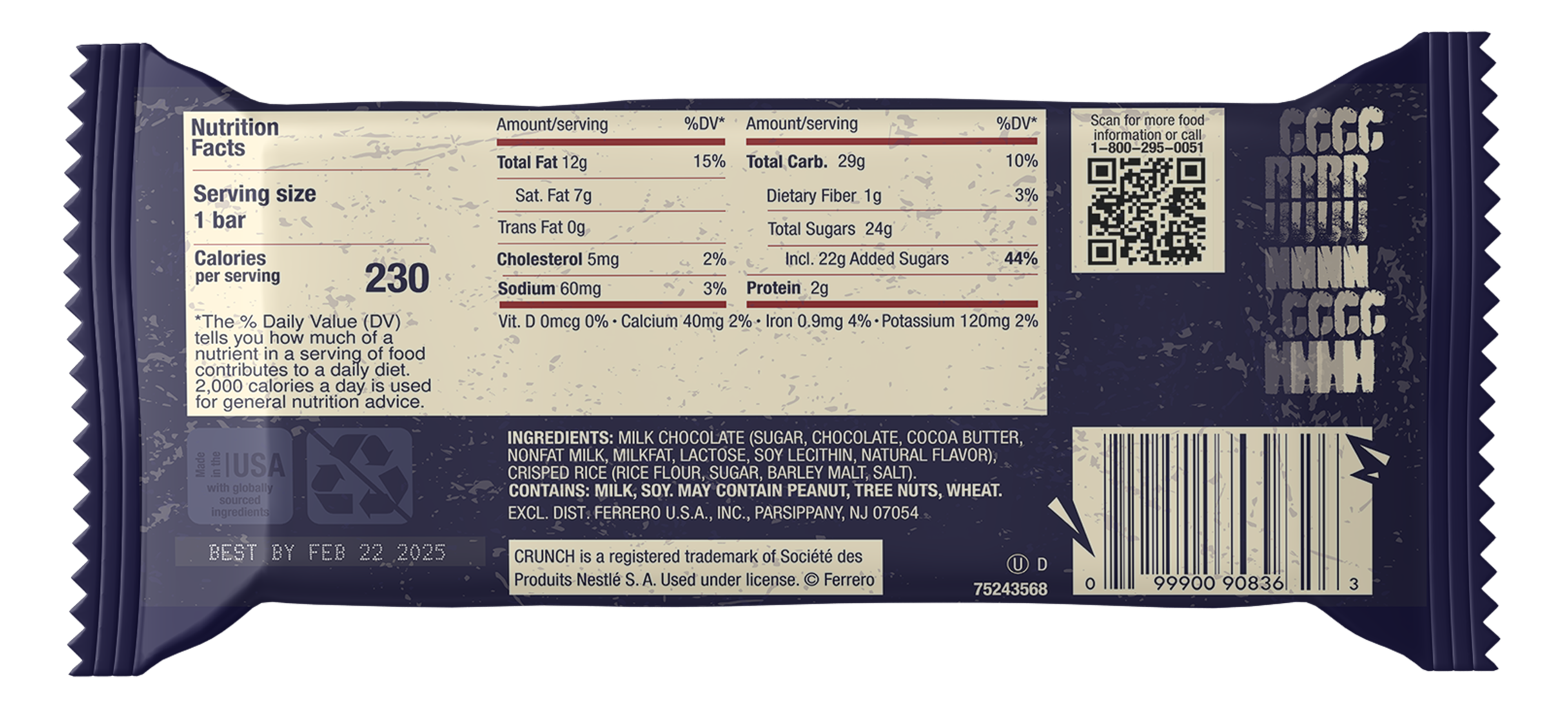
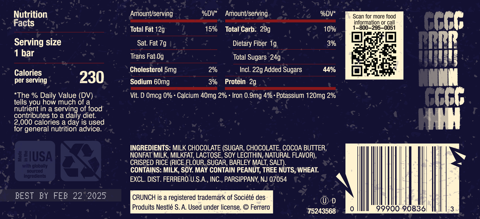
Once research concluded, physical sketches were drawn out to brainstorm different layouts and potential ornamental ideas. After sketches were eliminated, the winning idea was moved into Adobe Illustrator. There, typography, effects, and additional elements could be explored. Students were to make parts of the packaging as if it were actually to be distributed out in the world. Significant elements included expiration date, trademarks, and other nutritional or government-required information.
Once research concluded, physical sketches were drawn out to brainstorm different layouts and potential ornamental ideas. After sketches were eliminated, the winning idea was moved into Adobe Illustrator. There, typography, effects, and additional elements could be explored. Students were to make parts of the packaging as if it were actually to be distributed out in the world. Significant elements included expiration date, trademarks, and other nutritional or government-required information.
["Why not 'Nestle' Crunch? Something that was found in research is that Crunch is actually no longer owned by Nestle in the U.S.!]
Reflection: I feel like my love for the aesthetic I was given can clearly show within this piece. Creating something that felt like it could be a real product on a shelf gave me deep satisfaction, and I found that I enjoy package / product design more than I would have expected through this project.