This project was part of an Identity Systems class, in which we learned how to create a unified system for branding. Students were tasked with choosing one of three local chicken places (Bojangles, Raising Cane's, and Party Fowl) and rebranding the locations' identities, whilst retaining familiarity and recognition within the consumer base.
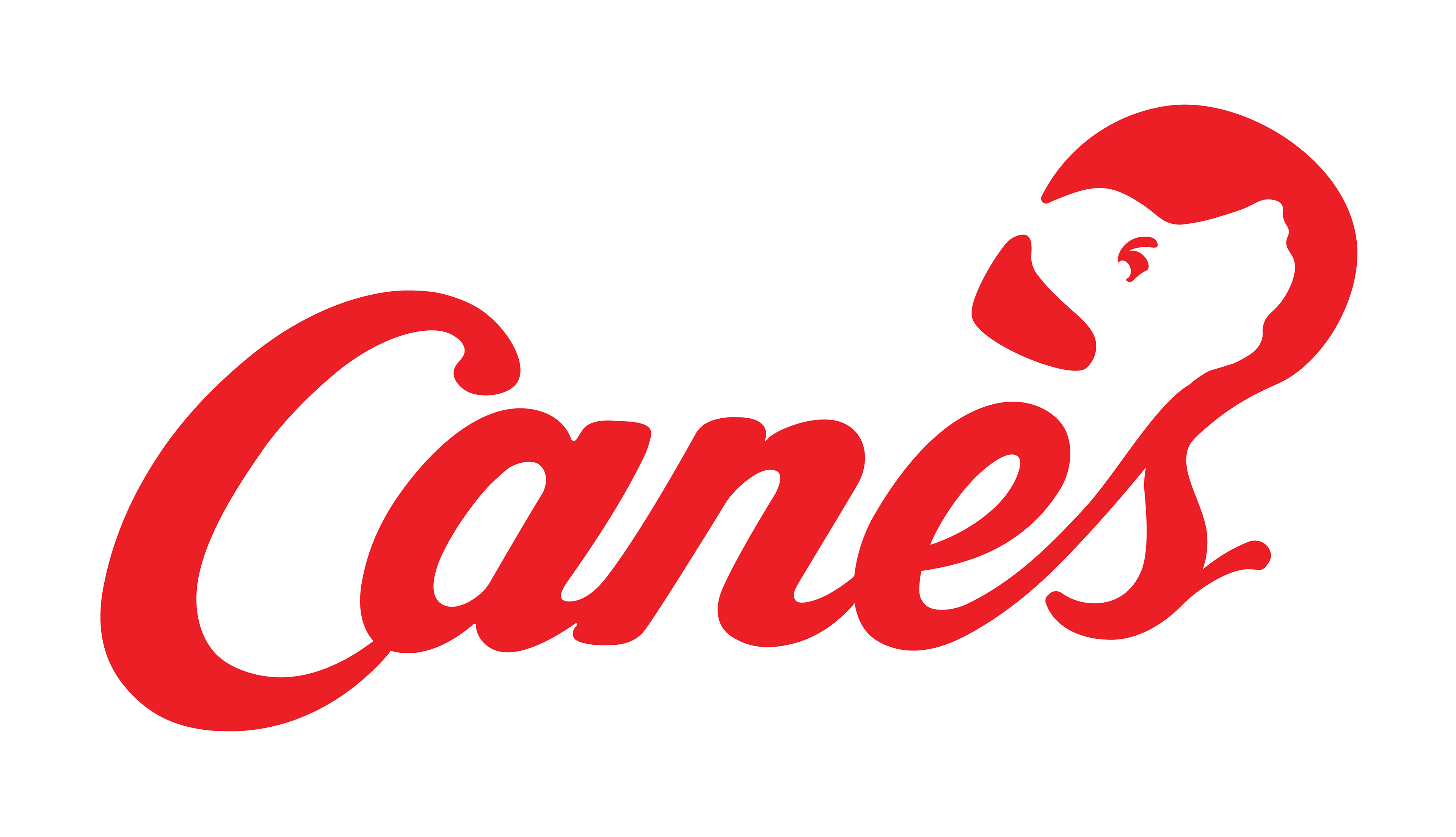
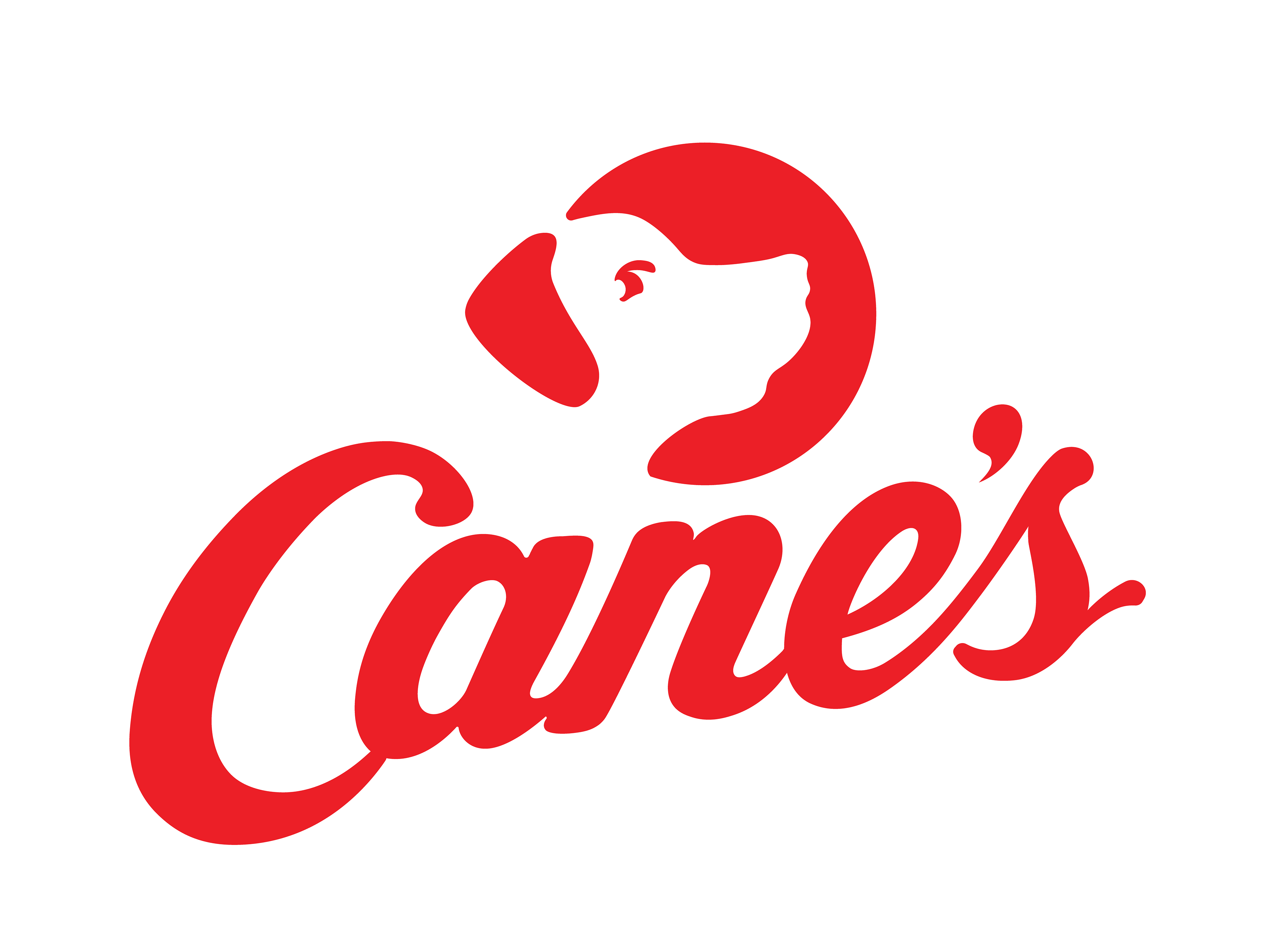
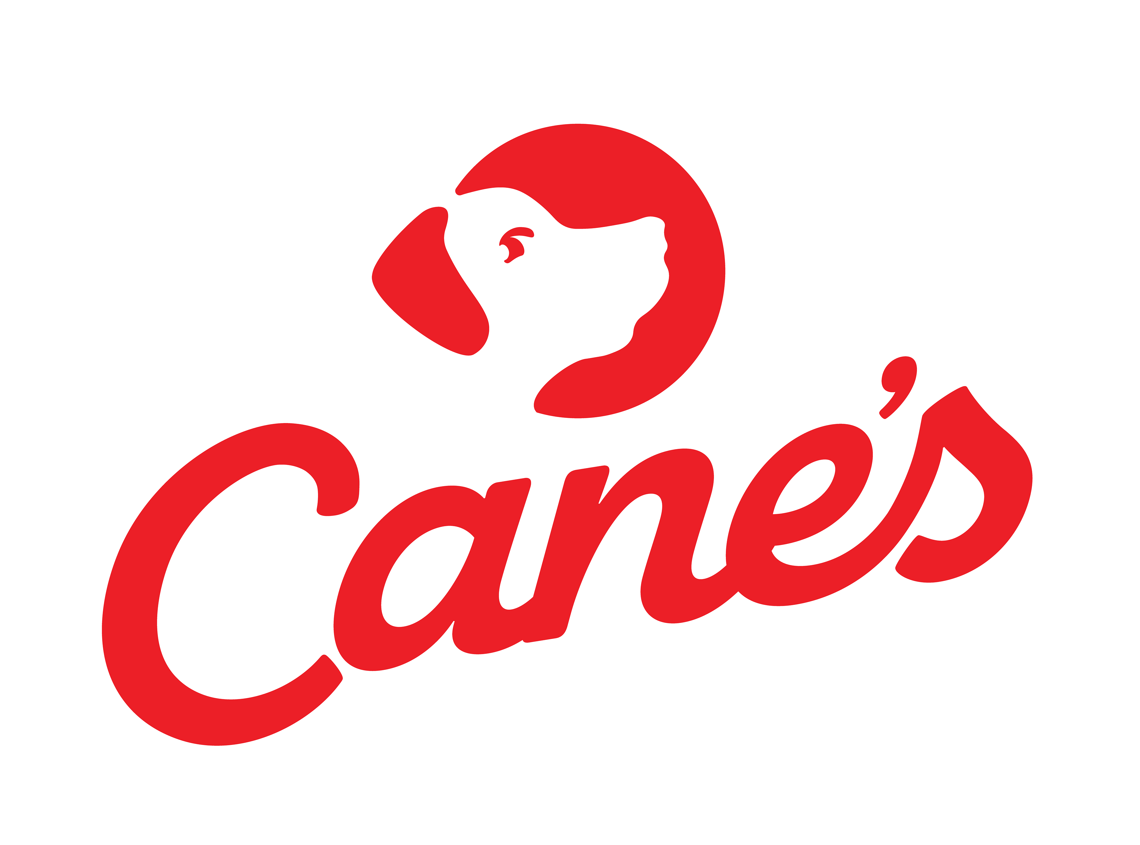
Process: Choosing a restaurant to rebrand was extremely easy for me, as Raising Cane's was a nostalgic and loved place for me. Something I personally always admired about the theme of Raising Cane's was how much it was centered around the original namesake, a golden Labrador named, of course, Raising Cane. Due to that strong emotional tie, I aimed to incorporate the "dog" theme into the restaurant's branding further. Something that I found interesting when researching the Raising Cane's history for this project was how important he (the dog) actually felt, but how little he was portrayed aside from in the kids' toys.
As usual, I began my process via some sketches. Initially, I was hoping to play around with the scripture of the word "Cane's", visualizing a dog shape out of the apostrophe and "s" characters. After multiple sketches, both physical and digital, as well as a printed prototype, I determined that the new mark was too subtle within the flat style that I was shooting for, however clever the initial idea had seemed.
After further thought, I decided to illustrate a flat/silhouetted depiction of a golden Lab's portrait. I then simplified some of the shapes to make a more stylized appearance. Keeping simplicity, but turning a silhouette into a recognizable figure, I added an eye. The silhouette was combined with a circle in order to create an appearance of negative space. Finally, an ear was added for multiple reasons; it acts as the apostrophe within "Cane's", improves recognizability of the figure, and additionally closes the negative space between the figure and the shape behind it.
Additionally, the 'Chicken Fingers' subtitle was dropped from the main logo, as I found that the public almost always refers to the restaurant as simply "Cane's".
Reflection: I never really expected to have a project where I rebranded something I was already as familiar with as Raising Cane's; in hindsight, it can be both and upside and a downside. While you find yourself loyal to the branding that exists, that in turn also becomes the issue. I believe that finding that balance between what to keep and what to change is absolute key. There is a fine line between recognizable versus simply distinguishable, and I find that I successfully accomplished the former with this rebrand, creating something fresh while still sticking to its loved roots.